Branding
Rogue Ocean
Rogue Ocean is a unisex jewelry brand that delivers high-quality pieces using premium recycled materials.
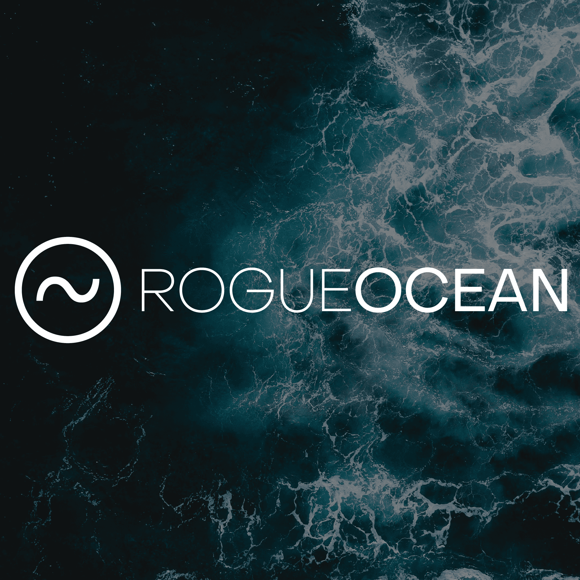
Rogue Ocean is a unisex jewelry brand making high-quality pieces from premium recycled materials. Their product was distinctive, their audience was clear: adventurers, go-getters, people who live life at full volume; but the brand had no visual language to match that energy.
The ask was a complete brand identity from the ground up: logo design, product packaging, business cards, and the supporting collateral to bring it all together into something cohesive and market-ready.
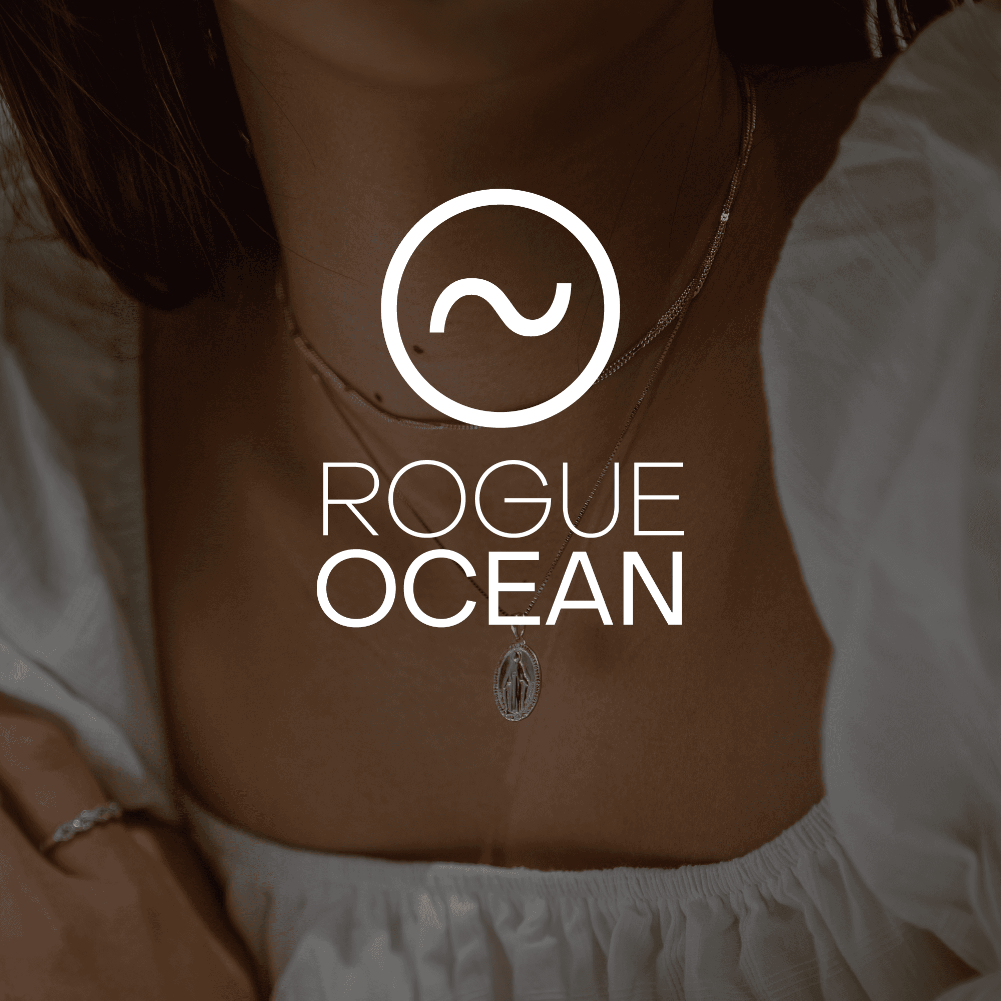
Rogue Ocean had two things working in their favor: a genuinely differentiated product that featured recycled materials, sustainable packaging, unisex appeal, and a target audience with a strong, identifiable identity. What they didn't have was a brand that could speak to that audience.
In a competitive jewelry market, product quality alone isn't enough. The brand has to do its own work — communicating values, building trust, and creating the kind of first impression that makes someone stop scrolling. Without a cohesive visual identity, Rogue Ocean's message wasn't landing the way it needed to.
The challenge was designing a brand that felt simultaneously luxurious and adventurous, timeless and energetic without those things canceling each other out.



The logo had to carry the whole brand before anything else existed so it needed to do more than look good. It needed to communicate two things at once without saying a word: ambition and sustainability. Those are the brand's core values, and the identity couldn't work if either one was missing.
The wave addressed ambition the spirit of adventure, the energy of the audience, the forward motion the brand stands for. The circle addressed sustainability the commitment to recycled materials, the sense of completeness, the long view. Together they created a mark that was neither purely environmental nor purely aspirational, but both.
Minimalism was a functional requirement, not an aesthetic choice. A logo for a jewelry brand has to scale to a ring box, a business card, and a social profile without losing anything. The simpler the mark, the more places it can live.
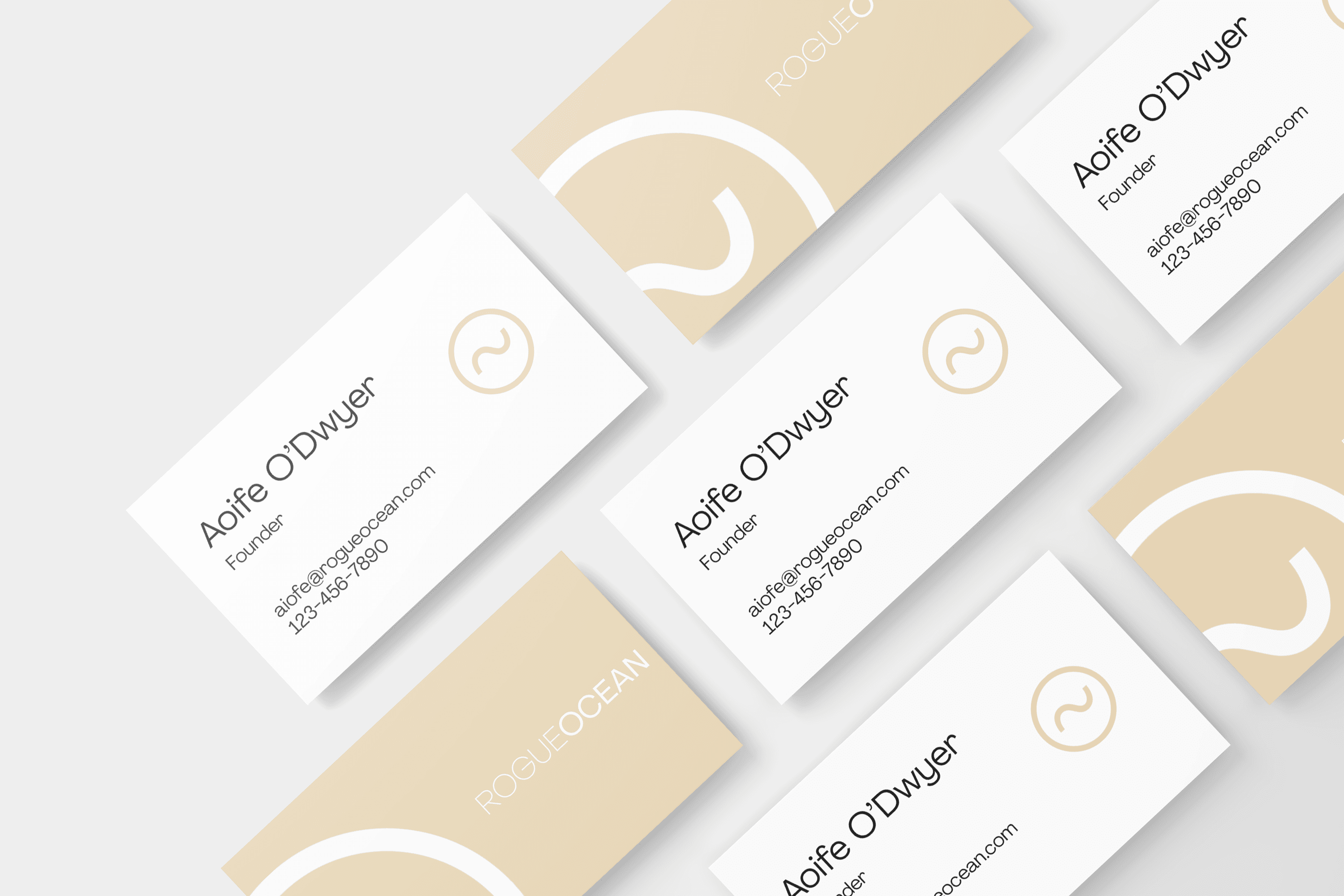
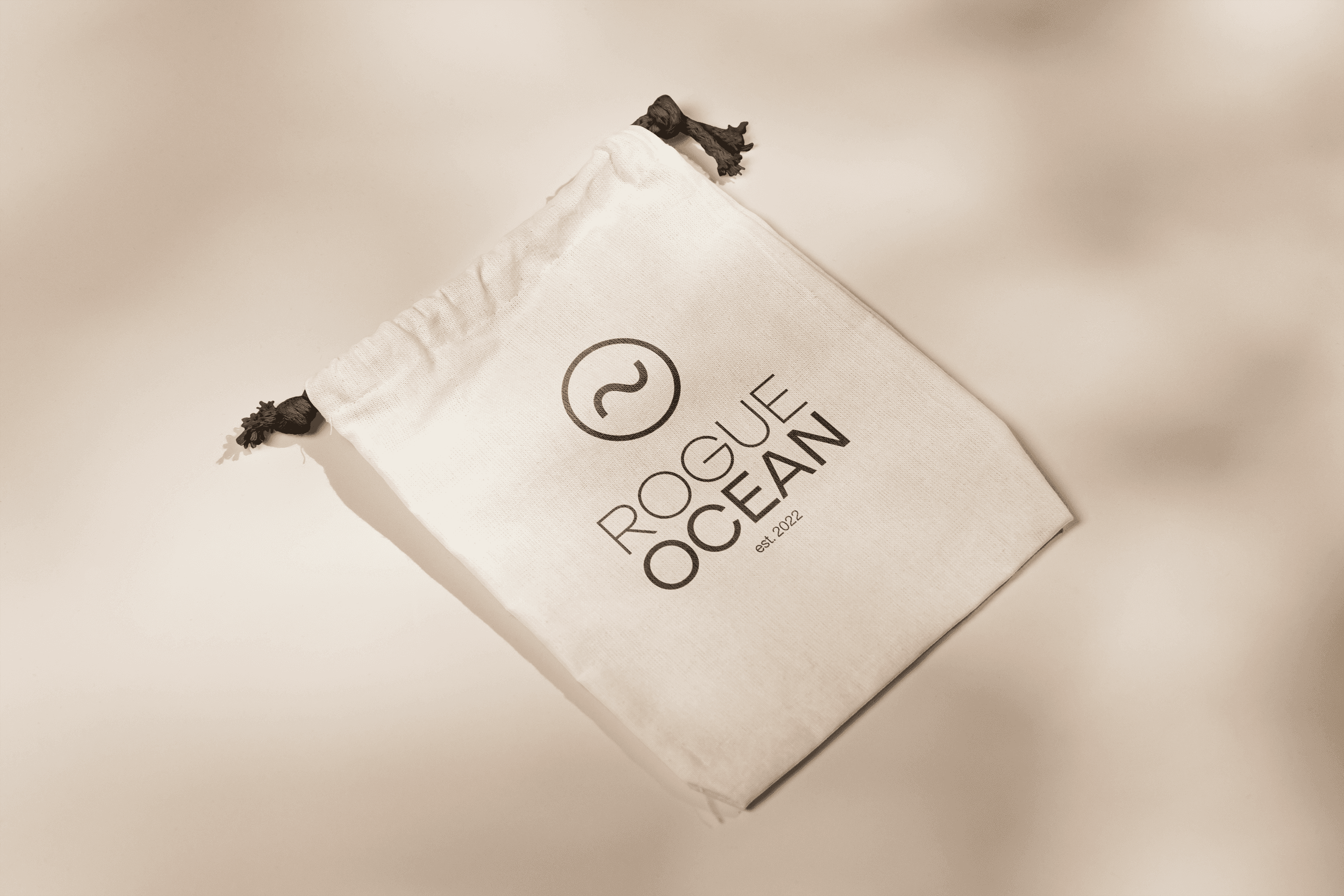
The Rogue Ocean visual system was built to hold up across every touchpoint from the logo down to the packaging tape. The wave-and-circle mark anchors everything: minimalist enough to be versatile, considered enough to feel premium.
Product packaging leaned into the brand's sustainability story eco-friendly materials chosen deliberately, not as an afterthought. The business cards were elegant and stripped back, leaving a lasting impression without competing with the products they represent.
The full identity logo, color system, typography, packaging, and collateral works as a unified whole. Every element speaks the same language.


Rogue Ocean went from a brand with no visual identity to one with a complete, cohesive system with a logo, packaging, business cards, and supporting collateral, all designed to work together and hold up over time.
The identity communicates both sides of the brand simultaneously: the luxurious and the adventurous, the timeless and the energetic. That balance is what the brief called for, and it's what the finished work delivers.
More than any single deliverable, what Rogue Ocean demonstrates is the value of a brand built with intention. When every visual decision points in the same direction, the whole becomes more powerful than the sum of its parts.

Next case studies